Content Design
A Content Design System
Standardizing message type and tone across every UI component — and bringing content in at the start of the design process instead of the end.
1 Problem
UI messaging was inconsistent — error banners, toasts, empty states, and modals were each written on the fly, with no shared point of view on tone, structure, or when to use which pattern. Content was too often treated as something that gets "fit into" a design after the fact, which meant rework and churn late in the development cycle.
2 Approach
I led the team in building a content design system that treated messaging as a set of reusable, well-specified components rather than one-off copy.
- Defined message type and recommended tone for every UI pattern in use — information banners, alert/error banners, toasts, system banners, empty states, cards, modals, and tooltips — down to header casing, punctuation, and when a full stop is or isn't appropriate.
- Published the system in the Quix Design System and ZeroHeight so designers and developers could self-serve the right pattern instead of asking a writer each time.
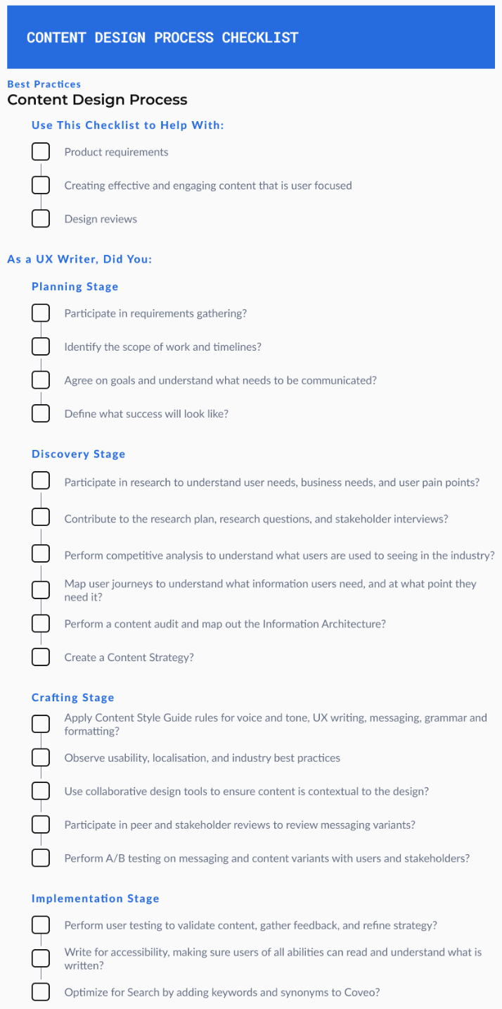
- Shifted the team to a content-first process: UX writers joined at the UX Content Strategy and Task Flow Messaging stages, not after wireframes were locked, using shared templates for content strategy, terminology review, and UI copy requests.
- Brought AI into the editorial workflow — enterprise Grammarly tuned for product content (Figma, GitHub, Word, Excel, PPT) enforcing the team's voice, tone, and Equinix Dictionary terms at the point of writing, plus an early GitHub-Actions-based bot (internally nicknamed "GregPT") reviewing repo content for grammar and tone consistency.
3 Result
Writing quality improved by 90% as measured by the team's own governance and editorial review metrics, and design-development churn dropped as content stopped being an afterthought. In 2023, UX writers applied and presented the content-first approach across 18+ major initiatives — including Notification Center, Bell Drawer, Accessories Catalog, Identity, and Unified Support — and the reusable Figma-to-code plugin born from this work, Content Companion, won the company Hackathon.